Flutter: Exploring more widgets
Checkbox
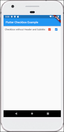
A checkbox is a type of input component which holds the Boolean value. It is a GUI element that allows the user to choose multiple options from several selections. Here, a user can answer only in yes or no value. A marked/checked checkbox means yes, and an unmarked/unchecked checkbox means no value. Typically, we can see the checkboxes on the screen as a square box with white space or a tick mark. A label or caption corresponding to each checkbox described the meaning of the checkboxes.
In this article, we are going to learn how to use checkboxes in Flutter. In Flutter, we can have two types of checkboxes: a compact version of the Checkbox named "checkbox" and the "CheckboxListTile" checkbox, which comes with header and subtitle. The detailed descriptions of these checkboxes are given below:
Flutter Radio Button
A radio button is also known as the options button which holds the Boolean value. It allows the user to choose only one option from a predefined set of options. This feature makes it different from a checkbox where we can select more than one option and the unselected state to be restored. We can arrange the radio button in a group of two or more and displayed on the screen as circular holes with white space (for unselected) or a dot (for selected). We can also provide a label for each corresponding radio button describing the choice that the radio button represents. A radio button can be selected by clicking the mouse on the circular hole or using a keyboard shortcut.
In this section, we are going to explain how to use radio buttons in Flutter. Flutter allows us to use radio buttons with the help of 'Radio', 'RadioListTile', or 'ListTitle' Widgets.
The flutter radio button does not maintain any state itself. When we select any radio option, it invokes the onChanged callback and passing the value as a parameter. If the value and groupValue match, the radio option will be selected.
Flutter Switch
A switch is a two-state user interface element used to toggle between ON (Checked) or OFF (Unchecked) states. Typically, it is a button with a thumb slider where the user can drag back and forth to choose an option in the form of ON or OFF. Its working is similar to the house electricity switches.
In Flutter, the switch is a widget used to select between two options, either ON or OFF. It does not maintain the state itself. To maintain the states, it will call the onChanged property. If the value return by this property is true, then the switch is ON and false when it is OFF. When this property is null, the switch widget is disabled. In this article, we are going to understand how to use a switch widget in the Flutter application.


Comments
Post a Comment